Thursday, December 9, 2010

MFA 1 Show


Upon walking into the MFA 1 Show, the first thing anyone will notice is the giant boar head spewing fake blood into a huge barrel by Max Cemeno called go ugly early. Needless to say, this mixed media piece was greatly disturbing but in a way slightly cool. Granted I knew it was fake blood (well I really hope it is!) it still has a gross factor. The boars head was mounted on a small wall in the middle of the floor right in your viewing range. Before walking up to it for further inspection, I was wondering how the barrel didn’t already fill itself up! But there is a hose running from the barrel to the bottom of the structure, through the back and back up to the head so it can continue to spew it out. After looking at this piece and walking around it, I was drawn to the installation piece of Erika Hickle called really-nice-sunsets_Large. I love the way these were presented in the show! These tempera on paper with a vinyl background took up the whole side wall. It looks to be the night sky behind the three right after the sunsets. It’s like the process of which the sunset takes place at night. I love that they all look like desert type sunsets like they were taken somewhere in Arizona or somewhere near there. It is not like the normal straight forward painting of a sunset with everything perfectly aligned or looking exactly like a real-life scene. I really like how it looks like the cacti are melting along with all of the other colors present in these pieces. I love how it looks slightly dark and eerie even when it is supposed to be a beautiful sunset. Very ironic yet beautiful at the same time.

In the distance I could hear this weird thumping noise coming from the back room. So I went to check it out only to find as very interesting movie playing. Derek Franklin had a video called complicated relation playing next to two large canvases that looks to have been beat to hell. As the movie played on I could hear a woman’s voice and see her in a dominatrix outfit beating the canvas with a whip and talking “dirty” to it. I was taken aback by this at first because I wasn’t exactly sure what I was even viewing and witnessing. But as I continued to view this video, I noticed that the canvases hanging on the wall next to the tv were the ones she was hitting entitled Reinhardt #7 and Reinhardt #1. These pieces intrigued me quite a bit because without the video, I would have just thought it was paint and holes that were put into the canvas with a knife or something. The video definitely tied everything together for me and really made me enjoy the piece that much more. It made it impossible to ignore with the loud sounds of the video in the room.
I walked across the gallery into the next room all the way into the back where I was confronted with another video that looked like robbers stuck in a chimney. This mixed media installment was by Stefanos Milkidis entitled Entrapment. It was very interesting next to the large installation of what looked like a chimney. I found myself trying to be able to peer into the structure (a failed attempt of course haha) to see if the people were actually still in there! But of course, it must have been pre-recorded, maybe it was an earlier performance piece of the day the show opened. Regardless I did not want to leave the room at first in hopes of maybe seeing the three people all dressed in black like robbers be able to climb out of the hole they are in.


Another artist that really caught my eye was Jim Brittingham with his two mixed media pieces both entitled Untitled. These two had so much color that they pretty much just jumped off the wall at me. It was such an excitement for me to see such beautiful colors that I had to stop and stare for a while. There was a lot of the use of spray paint it seems and a lot of things pieced together to create the whole of the piece. It was very intriguing to look at and wonder what the artist’s intent and thought process was while creating these fantastic and interesting pieces.
I left that room and went back into the main gallery room to exit the gallery. One thing I will admit is that as I was leaving, I again stopped to look at Erika’s work on the wall. It really kept with me all throughout the show. There was one thing however that bugged me about the show as a whole. There were no labels on the wall accompanying any of the pieces in the show and it made it a little hard to know whose work I was looking at. The diagram that was presented at the entrance of the gallery was not very helpful either. Everything was numbered in a very weird way and it was hard to get my bearings of which piece I was looking at in the given moment. I guess you could say it was a diagram leading you through the gallery but to me it was very confusing. Other than that, I did enjoy the show and wish I could meet some of the artist themselves to talk to them more about their work personally.

Sunday, November 21, 2010

Studio Journal 8


I tried a new way of shooting the lights the other day. But does this look too much like ghostly figures moving through the pictures? I am not sure if this one will fit into my project of dancing figures. But maybe I am wrong. I do really like this image though. Now....thoughts on sizes...do I make them really big poster sized images that could be like a my-size mirror-like image? Or do I keep them to a normal like 11 x 14 or 20 x 20 piece. I am leaning towards life-size photos! And maybe this does fit into my project. I do want people to take away from it what they will.

Studio Journal 7

(As taken from my journal on NOV. 13, 2010)

I couldn't copy images from this site but it gave me a little more inspiration toward my own project and really intrigued me. I really love this artists work. The Cosmo series is just like mine but with a totally different meaning. At first look I didn't read the artists statement about the series I just looked at the pictures. Upon further investigation I had found out that it was couples making love with glow lights on them to make the amazing forms. That is EXACTLY what I want people to get from my own project! Except, my lights are not from people making love haha.
http://atsukomorita.com/index2.html

Studio Journal 6

(As taken from my journal on NOV. 5, 2010)

Today was a crit day in Thesis. My fellow classmates had great feedback and suggestions towards my lights project. Some even guessed right about what I was trying to achieve. I finally got over my mental block. But I still have a ways to go before it is complete. I have some new directions I want to try before the year is up.

Here are a few examples:

Studio Journal 5

(As taken from my journal on NOV. 1, 2010)

Had a critique in photo class today. I needed a break from my colored lights project and did a few photos with a focus on one color. An isolation of colors is what I did. It wasn't exactly one of my better projects but I did like a few of them. But, it gave me enough time to get rid of my mental block for my thesis project!


Studio Journal 4

(As taken from my journal from OCT. 27, 2010)

I feel like I am not getting anywhere with my thesis project. I feel like it isn't coming together the way I want it to be. I really need to figure out what I want to achieve with this project. I really want to make people stop and wonder; What could it be? What does it mean? Energy light sources dancing?? Maybe I just need to re-shoot and get some more pictures and see how they turn out. I just need some more inspiration.

Studio Journal 3- Musical Inspiration

(As taken from a journal entry from OCT. 22, 2010)


When I create art I love to listen to music. I feel that it helps me to not focus on anything and just do it. It helps me to go with the flow and not stop and get distracted by outside elements. I just put my ipod on shuffle and go.
Today's inspirational music selection:

Bubble Toes-Jack Johnson
Hand In My Pocket-Alanis Morissette
Speed of Sound-Coldplay
Halo-a Glee mashup
Fields of Gold-Sting (Gotta love my oldies)

Studio Journal 2- More Inspiration

(As taken from my journal on OCT. 19, 2010)

It rained today. So, no work. I decided to look up a few artists that would inspire me for my thesis project.


Barbara Morgan, Samahdi, 1940


Barbara Morgan - Martha Graham, American Document, 1938

(This all goes along with the dancer aspect of my thesis project. Trying to make the lights look like they are dancing.

Example from my collection to show my real idea on thesis


This is what I am coming up with more ideas for. I want more of what I have done here. That is my goal.

Tuesday, October 12, 2010

Studio Journal 1- Inspiration


Song Yao- Night Traffic


Tim Corbeel- Last Passenger


Edy Santosa-Star Trails


Long Exposure Light Art
matt.mcdonald7- Long Exposure Light Art

Sunday, September 19, 2010

WLCM BCK Review


The first piece that caught my eye of this show was Dream Girl by Alan Prazniak. This was a smaller piece in the show but it definitely stuck out when I first walked into the gallery. It is a head that looks like the head of a pharaoh or part of ancient Egyptian pyramids. The head is covered with oil on a puzzle with a bunch of earrings on it which made it very shiny. The oil reminds me of a bunch of crayons being melted down and the wax being used to cover the head. Upon closer examination, I was able to notice that it was not the head of a pharaoh but is actually one of a female. What would be cool to find out is if this was a sculpture that the artist made of one of his female friends or if he just created it freehand. There are quite a few earrings in the head too. There are two in the place of where the heads ears would be and a bunch on the back of the head. To me it looks like the earrings on the back make up the hair of the head. Almost possibly signifying that the dream girl has shiny hair that shines like gold. It definitely draws your eyes when first walking into the gallery with its placement and shiny elements.


Behind the Dream Girl, my attention was caught by a piece made by Patrick Strzelec called Syn. It was made out of cast aluminum, limestone and stainless steel and is completely green. It has many (what I will call) arms coming from the center of the sculpture. It kind of looks like it could fall over at any minute with one false move from the viewers walking around the gallery. Syn kind of looks like a cool I am unsure of what to really take from this piece but I am oddly very drawn to it. Maybe it’s because it is green in color. I am not sure what attracts me to this piece but I feel like I want it in my house on a coffee table. Just like the Dream Girl piece it definitely is an eye catcher to draw the viewer in to figure out more about it.


Moving into the other room, I noticed a photograph taken by my photography teacher, Kate Pollard. This photograph, called Reynolds Girls, is a very intimate piece. It’s a 20 x 20 print and really invites you into the moment with these women. You can sense the intimate feelings these three women have for each other. It looks to be two granddaughters surrounding their grandmother with love and affection. The grandmother looks like she is very ill and they are helping her with everyday tasks around the house such as filling in the calendar with upcoming events. They are hovered around a kitchen table and very close together. This room was filled with things I did not really understand so it was nice to see something familiar that I could relate to and have a better understanding for. It’s placed right at eye level to engage the viewer to be at the same level with the people in the photograph like we are intruding on a very private moment. I feel somewhat like an intruder because they are both looking at the grandmother and her eyes are closed looking like she is very tired. It definitely gives you a mournful feeling as you look in on their interaction but also gives off the feelings of love, respect, and family togetherness.


The one part of this gallery show that really stuck with me and had me awed was the exhibit by Jim Toia’s Dissolving Gardens. You could hear the music coming from the enclosed room in the front of the gallery. The music alone was enough to draw me in. It was a dark room with a projection on one wall and a TV screen covered by a cloth so it looked like just the screen. Both were displaying nature scenes but the one that stuck out to me the most and really had me mesmerized was the projection on the left wall. It was a projection of waves in the background along with what looked like a tree maybe. The background was in constant motion. In front of the whole square of the projection, were a bunch of little things sticking out from the wall. Upon a closer inspection, I found that they were objects from nature; such as tree bark and mushrooms pinecones and other dead looking objects. This piece entranced me because you sometimes can’t tell what is behind the items because every time I tried to focus on the background my eyes would go cross-eyed because of the objects on the wall. The shadows from the light of the projection onto the wall give the piece more depth as well. This piece to me could possibly be showing the crumbling of earth’s plant life because all of the objects on the wall are dead. It could very well be demonstrating the decline of the world’s natural resources over time. I loved the fact that this was in its own separate room because nothing else would be able to stand with it. This is definitely an exhibit that deserves its own space and a lot of time to observe and take away what you will.

Friday, September 17, 2010

Interview with Stephen Eberly

Stephen Eberly is a Printmaking major at Mason Gross at Rutgers University in New Brunswick, New Jersey. His work is mainly based on his vast imagination and his ability to create a wicked doodle! When looking at his work one might see his attention to detail and shadowing which really make his pieces pop. He has an interest in cartoon-y/doodle-ish designs and characters that really draw in the attention of the viewer. It is clearly evident that even though he does not have a set style he is particular to, his work does not come up short-handed at all. His early doodling has helped him tap into the depths of his creative mind and really produce amazing pieces of art.

Dylan: So what is your concentration?

Stephen: Printmaking.

Dylan: How did you decided on printmaking to study?

Stephen: The decision was kind of rash, but the further I delved into printmaking the more I realized it was a perfect fit. I'm a natural born doodler, so I love drawing from the imagination, and I love being hands on. Printmaking lets me do both.

Dylan: You're a doodler? Care to explain how that works?

Stephen: In high school, I was afraid art classes would influence me too heavily, and I just wanted to establish myself creatively before I started letting people tell me how to make art. So rather than loading up on art classes, I spent most of high school doodling like mad. And I'm pretty sure it shows in my work. There's a definite randomness to my work. And I like it. I try and push the spontaneity of my creative process to its limits. I had to play a little catch up in terms of developing my ideas from doodles to works of art, but there is no shortage of ideas.

Dylan: So would you say that doodling is what inspires you or is there something else that your work comes from? And college was the first time you've ever taken an art class?

Stephen: I'm not sure if I would say doodling inspires me, as much as its trained my creative process. It helps me tap into a more subconscious, spontaneous way of drawing inspiration. I couldn't really tell you what inspired the majority of my works, although I'm sure all the cartoons I watched as a kid (and sometimes as an adult) have lended to the surreality and underlying humor of my work. Oh, and as far as art classes...I had taken photography, and graphic design in high school, and even ceramics, but nothing that I felt would control my style in terms of drawing. I only took what I felt comfortable with as a creative outlet that was distanced enough from what i considered my passion; that being of course doodling

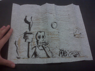
Dylan: That’s interesting! I've noticed that some of your work isn't printed on regular paper but on napkins and even a toilet seat cover. What made you decide to print on those instead of paper?

Stephen: I usually enjoy experimenting. And usually I printed on things that played off the subjected matter. For instance the rodents and bugs on a toilet seat cover, kind of made me think that that's what the cover is protecting us from, a kingdom of sewer dwelling vermin being kept at bay by a thin layer of tissue paper. A lot of my works tend to be influenced by the materials I choose to create them with, and looking for new surfaces to print on really jarred open a new realm of possibility and inspiration.

Dylan: I gotta say the thing about the bugs...gross I will never use a public bathroom again! haha

Stephen: ha ha

Dylan: So in printmaking, is there a particular printing process that you like doing the most? And can you describe the process?

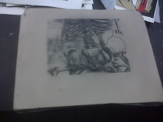
Stephen: I personally think my forté would be using lithostones. It lets me be very drawerly. Rather than working around the process, it usually boils down to how good are you at crayon drawings. And I didn't realize this until I started litho, but I still love crayon drawing. Lithostones are usually drawn on with a lithocrayon, and then etched using acid, and then rolled with ink so you can make multiple prints, and the image keeps rolling up. There is much more of a subtle value scale with litho than the other processes, which allows gradients, and shading, which is usually lost. But if I had to name number two, it'd probably be silkscreen.

Dylan: So with a lithostone you can have one color but it can be different shades of that color? Is that how that works? And it looks to be a pretty heavy stone!

Stephen: That is how it works. And you can even add another layer or two, but it gets to be tricky. And yes, the stones can get pretty heavy. As far as printmaking goes, litho can be the best in terms of exercise.

Dylan: And it looks pretty cool with the skeleton and all! Eerie but totally cool! How long does it take for you to complete something like this or anything else you do in here like a silkscreen project?

Stephen: Once I already have an idea, litho can take about a total of 10 hours. Silkscreen tends to be quicker though, I can usually bang them out in about 4 hours. And sometimes I can do more than one at a time.

Dylan: And that includes printing too?

Stephen: Yeah. And that's what I love about printmaking, and I'm sure as a photographer you can relate. Once I go through the effort to make one print, it’s not much more effort to make ten, or twenty, or sometimes thirty prints.

Dylan: Very true! Once you hit the right mark with developing time and exposure time or in your case right where you want it on the paper it is pretty easy to bang out as many as needed! Ok here comes the dreaded question....have any ideas on what you are doing for thesis yet?

Stephen: Yes, actually, in just the past few hours. I wanted knew I wanted to flood the viewer with imagery, but I was afraid the pieces would clash with each other at some point. But I feel if I keep this in mind, and try to stick to a primarily black and white scheme, i can pull it off. I'm not trying to rule out colors all together, but no one image is going to be chock-full of colors. Mostly just highlights. This isn't my definite plan. I'm still very flexible, and prone to change. But at the moment, that's what I'm going with.

Dylan: So you will have just little spurts of color here and there but it won't like some of your pieces that are complete color. I must say I like that. Your works with just one accent color in them are pretty amazing!


Stephen: Thank you

Dylan: What about after graduation? Any ideas on where you want to be?

Stephen: Whatever I can get, I suppose. But I would love to be an illustrator for children's books, or even more grown-up books if there's a call. And total pipe dream, but I always want to create a cartoon series. But pretty much anything that involves creativity and a decent salary is alright with me.

Dylan: That is pretty awesome! I hope that works out for you and I wish you the best of luck! Are there any last thoughts about you or your work you would like to leave me with?

Stephen: Well since we've been talking, and I've caught myself saying a lot about crayon drawing, and cartoons, and doodling, and I feel it comes off very simplistic and child-like. But my goal is to simply bring it along and elevate these simple basics to the point of legitimacy. And not to be cocky or anything, but I think I'm doing alright by it.

Dylan: I think you are too. And trust me, crayon drawing or not, still WAY better than any drawing I could produce! And I don't think at all that anything you've shown me is simplistic or child-like.

Stephen: Thank you

Dylan: Your welcome and good luck!

Stephen: You too.

Sunday, September 12, 2010

Water Exhibition Review

The Water exhibition at the Zimmerli Museum was very fascinating. You walked down the stairs into the gallery space and your eyes were instantly greeted with a work of art by Ross Cisneros called Ice and Ark. It’s an installation piece with fishing net and 200 plastic water bottles called Berg. The water inside these bottles is from a melting glacier in the North Atlantic hence its name. This was a great piece to put in the front room of the exhibit because it really draws the exhibit goers in. There is also text on the wall telling you all about water and how it is displayed in this exhibit. The water was interpreted in many ways. Through nature and an element, landscapes, gender roles, videos of water, books and facts on water, even poetry, allegory and reflections. Each room was centered around one of these themes. I believe that the message this show is trying to send is all about how important water is and how present it is in our everyday lives. It affects us in every way possible. This message I feel is very greatly displayed throughout the exhibition. The pieces had enough space to accommodate all and were able to stand on their own or as a whole in the description of the room they were placed.

The rooms were designed to be visually inviting from both sides. For instance, the front room was drawing you into it with its installation. Then as you peer into the next room, you are greeted by an installation piece by Maya Lin on the floor called Dew Point 18. This really drew my attention into the next room which was water as nature and an element. There were 18 glass blown spheres on the floor that looked like dew drops and were very artistically placed. The curator placed them in the corner so no one would ruin them and arranged them sporadically. The artist herself gave directions and said to arrange them in a random order. This was a great choice for both the artist and the curator because dew drops in reality fall and form at random. There would be nothing I would change about the placement of this piece.

Also in this element room was another installation piece that caught your eye and was place perfectly that you could walk all the way around it and it did not take away from the other art in the room. The Condensation Cube by Hans Haacke is a sealed cube with a little water at the bottom which was able to replicate the condensation process. What I really enjoyed about this installation was how the curator placed it in the room and with the way she had the lighting. The light hit the top in just the right spot to make the water on the top look like sparkling little crystals instead of water drops. You also could see the droplets fall and watch as the water rippled out in effect. It truly was an amazing piece of art and it was displayed in the best possibly way I could think of.

When looking on into the next room, you are drawn in by the beautiful landscape images of water. And as you turn the corner, right behind the wall of the Dew Point piece, there is another installation of Maya Lin’s on the opposing wall. It is called Pin River-Hudson. This landscape installation was made up of hundreds of steel pins! It took the installers at the gallery three days to install the whole thing! It is placed on the wall going down and looks like the Hudson River. The artist had templates on how to hang this piece so the curator only had control over what wall it went on and the lighting. I must say the placement couldn’t have been more perfect because it was on the opposite wall Maya’s other installation. It instilled the artist in your mind as you moved through to the next room instead of having the second piece a few rooms away. What was very interesting was the curator’s choice of lighting for this piece. She chose to light it from the top at a slight angle. This angle gave the pins shadows, giving them depth. This was a great choice on the curator’s part.

The next room about women in the water and men in boats, I did not really like that room as much. The pieces in there were good but none of them really caught my eye to really invite me into this room. To be honest, I could have skipped over this room without a second glance and I probably wouldn’t be that upset about it. The next room as well with the video I could have passed over and not really missed much. Honestly it made me kind of sea sick and nauseous. And I really did not get it and did not hold my interest. I don’t exactly know how I would do those two rooms better. I don’t believe the video room could have been improved considering it was the video I did not like. The ambiance of the room was actually relaxing. Maybe if there was a different movie playing which was also calm and relaxing I would feel differently.

The four images I chose to curate were the Ice and Ark, Condensation Cube, Dew Point 18, and Pin River-Hudson. I would arrange them in that order because they could all lead you into the rooms and leave you wanting more. These four pieces could definitely stand alone and be in their own show of water.